WE DID IT IN 103 DAYS.
The tracking mechanic was technically achievable. The harder problem was behavioural. Most fitness apps lose users within the first two weeks - not because the feature breaks, but because the product doesn’t give people enough reason to come back. The real brief was retention, not counting.
Calibration was the other critical moment. Camera-based rep tracking requires accurate position capture before every session. If that experience felt awkward or confusing, the product would fail at the exact moment it needed to work.
UX / Product Thinking.
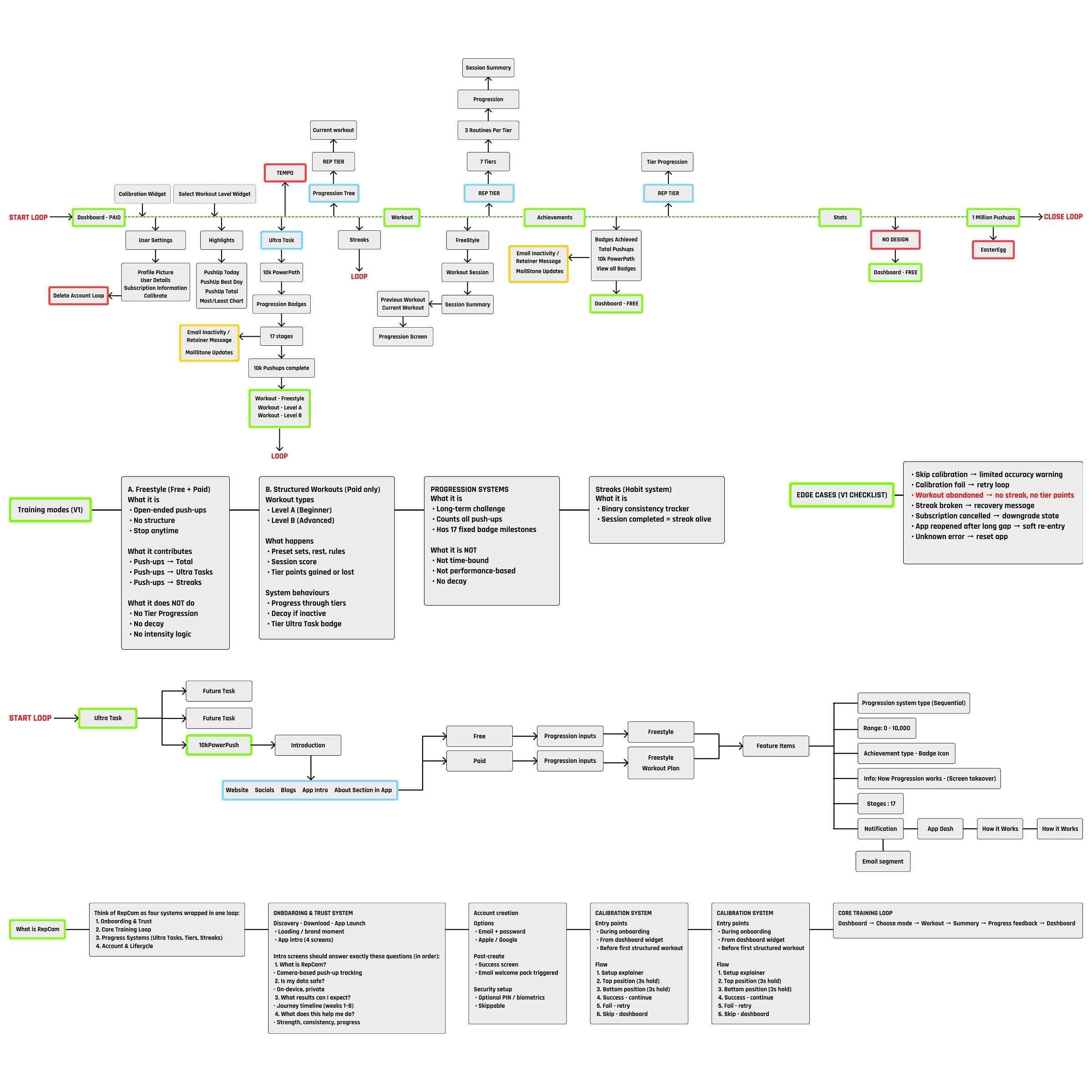
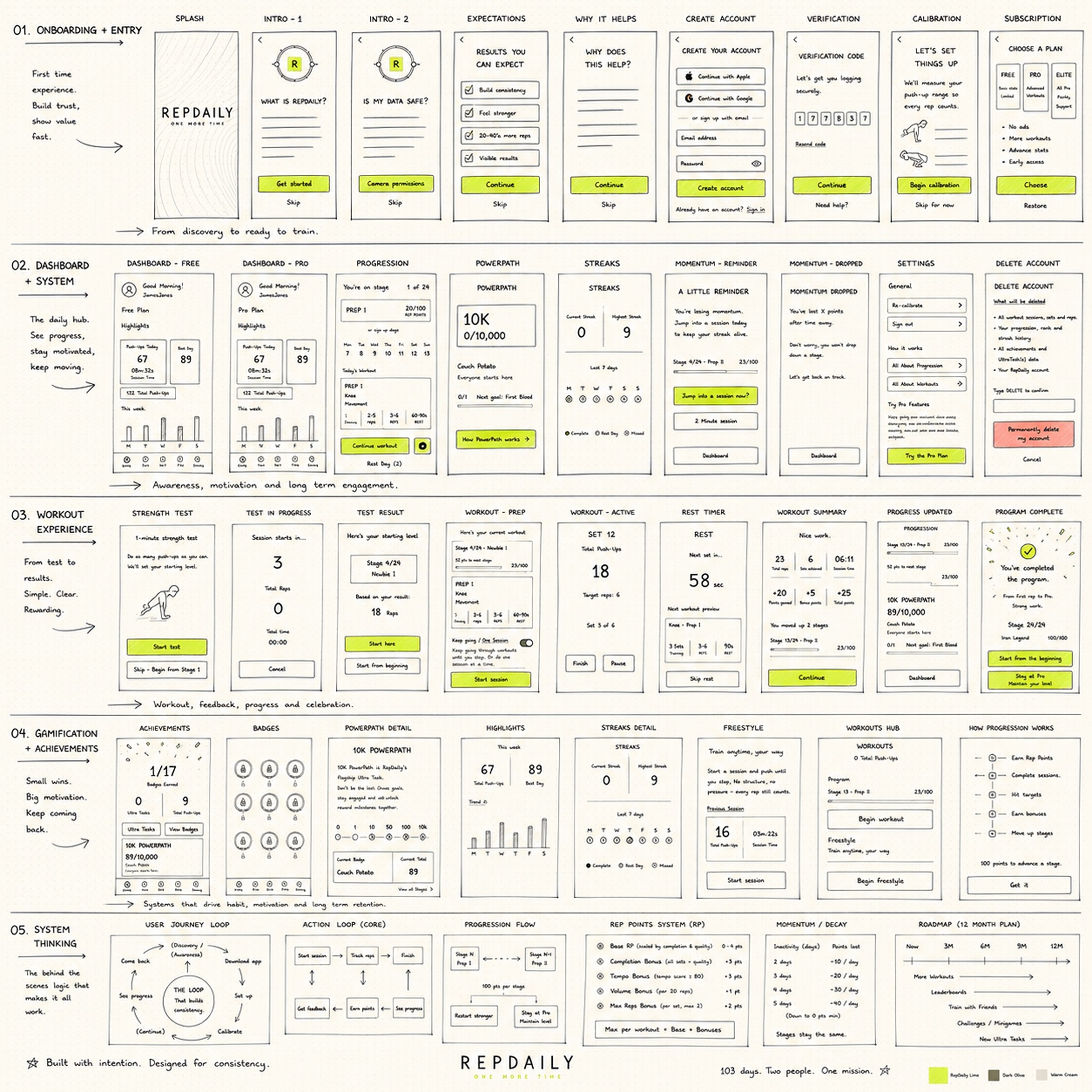
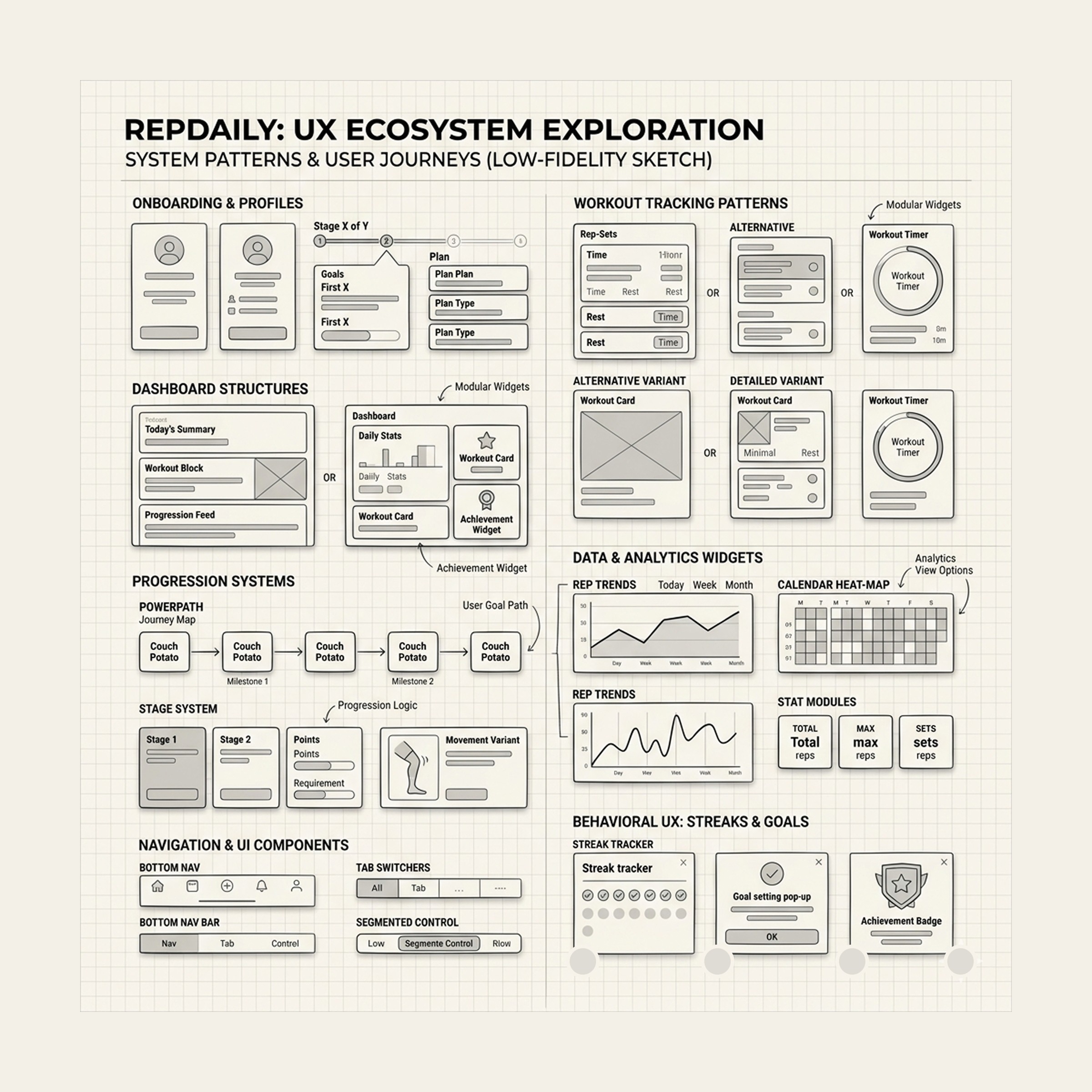
Before any UI was designed, I mapped the complete product ecosystem across six flow systems: onboarding, calibration, the core training loop, progression and achievement, dashboard states and the full CRM lifecycle. Each flow answered a specific question - where do users drop off, what keeps them moving, how do features connect without creating overlap.
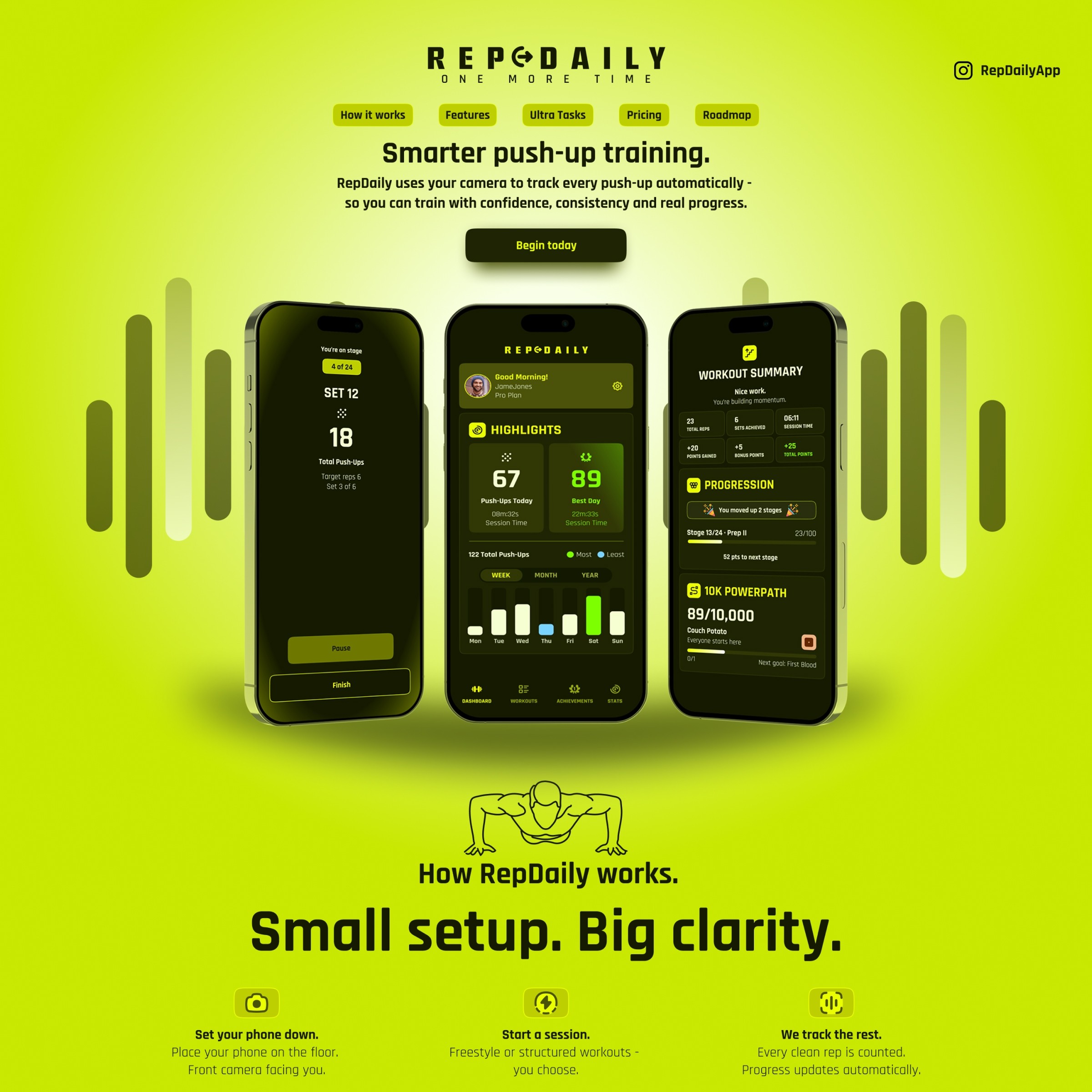
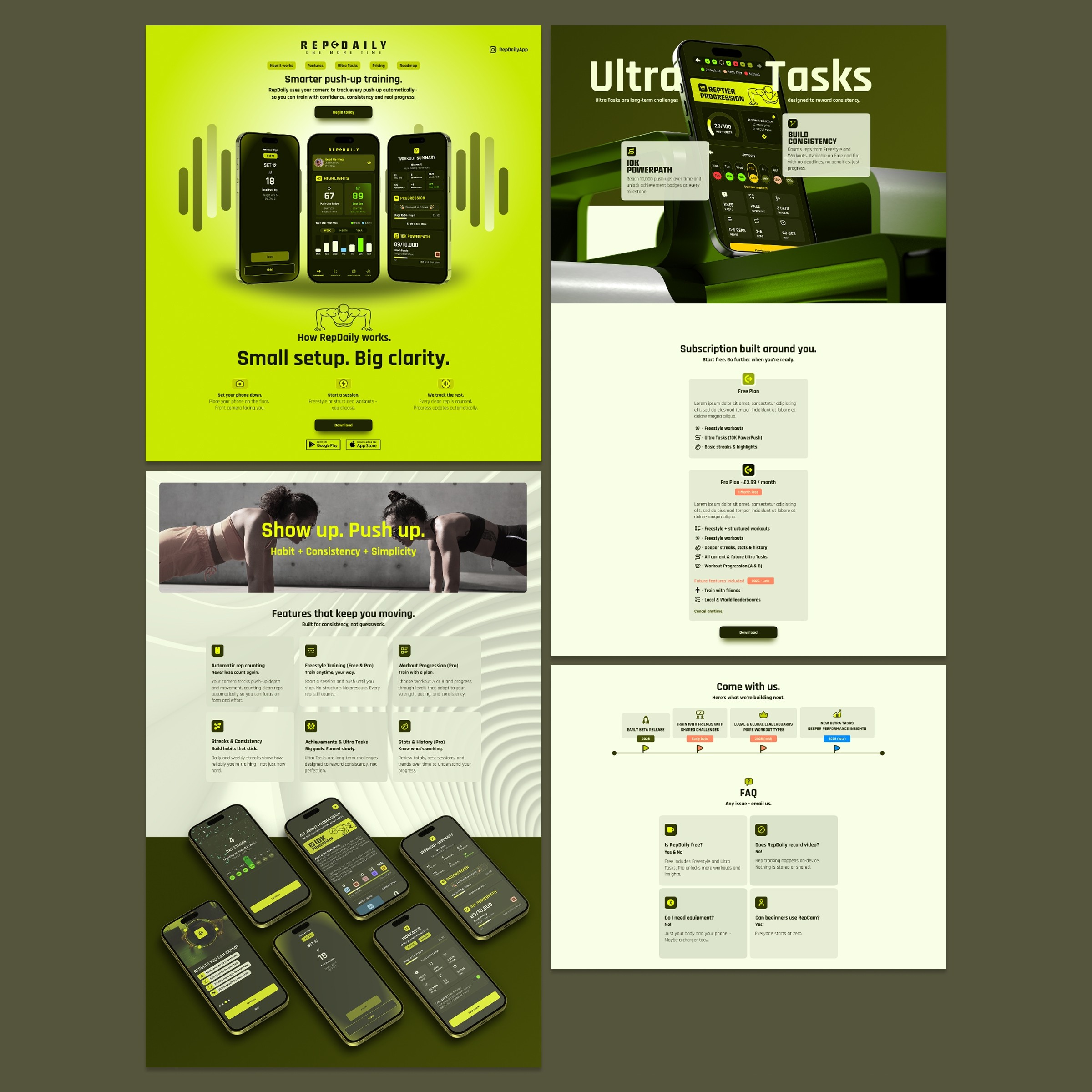
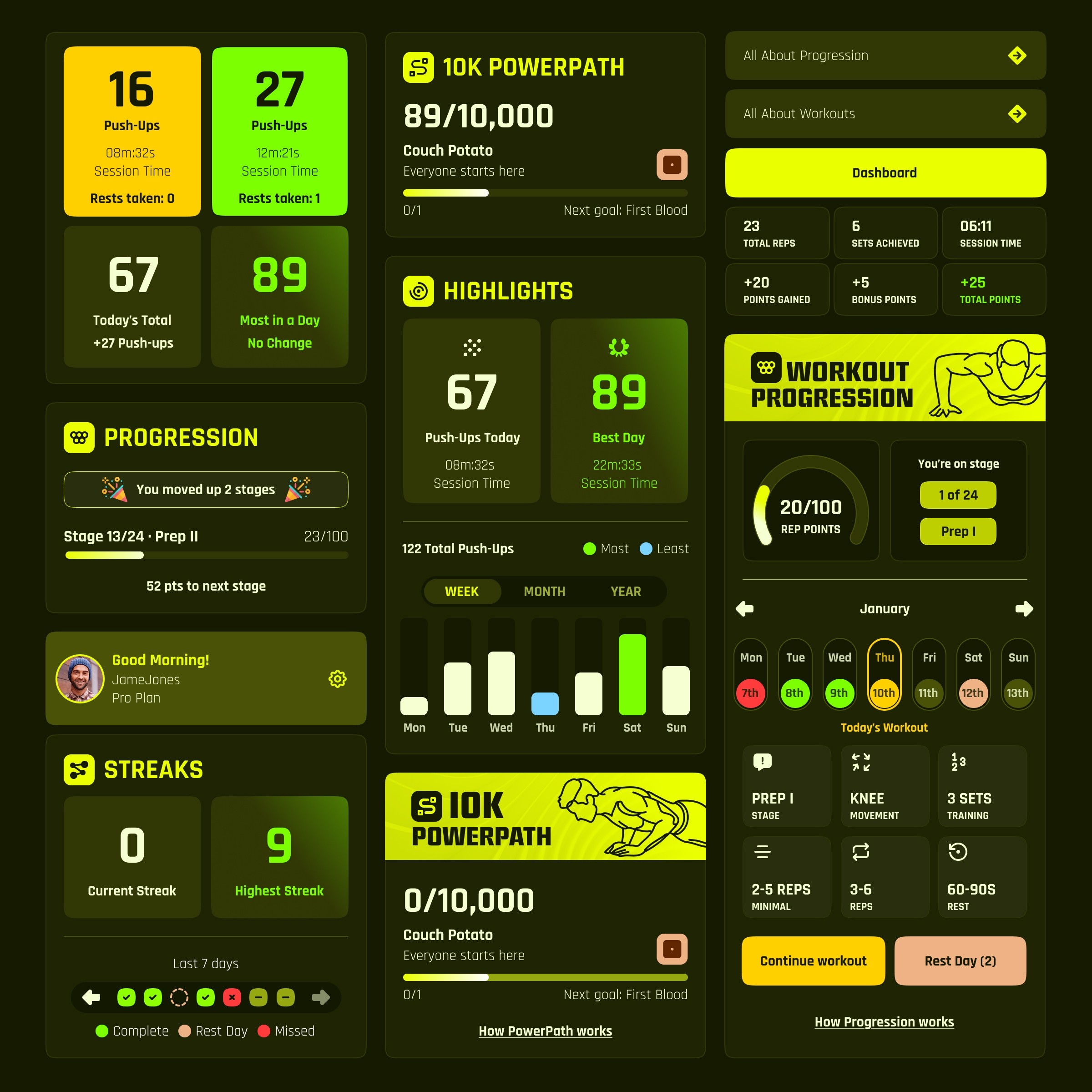
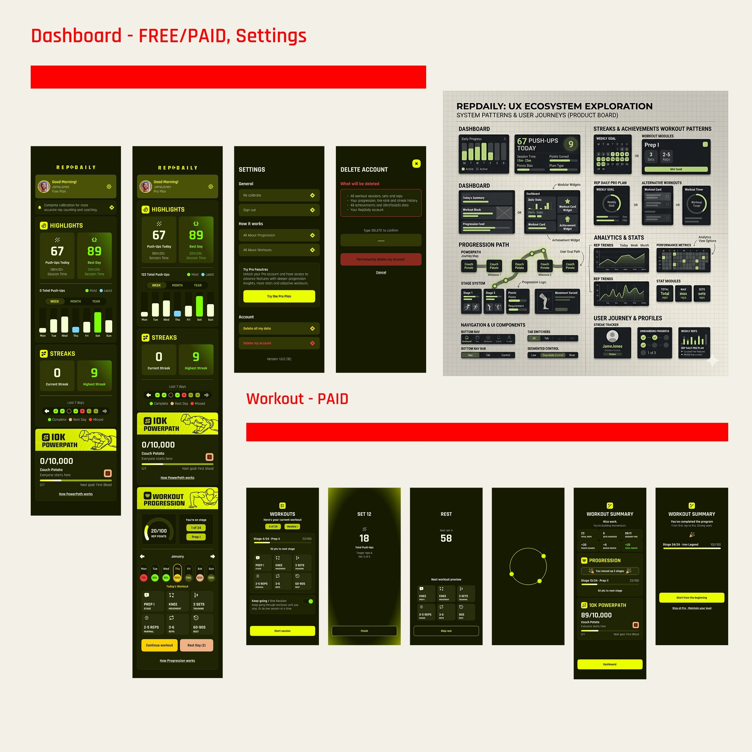
The Free vs. Paid split was a deliberate product decision. The free tier had to be genuinely useful - not a crippled demo - while Pro offered a meaningful step up through structured workouts, deeper progression and advanced analytics. The dashboard was designed around three fixed questions regardless of mode: what did I do, what can I do now, what am I working toward.
A beta committee of six personal trainers and six early users ran structured feedback loops throughout. Their input directly reshaped the calibration flow, the dashboard hierarchy and the session summary screens before launch.
Execution & Collaboration - AI Workflow Integration.
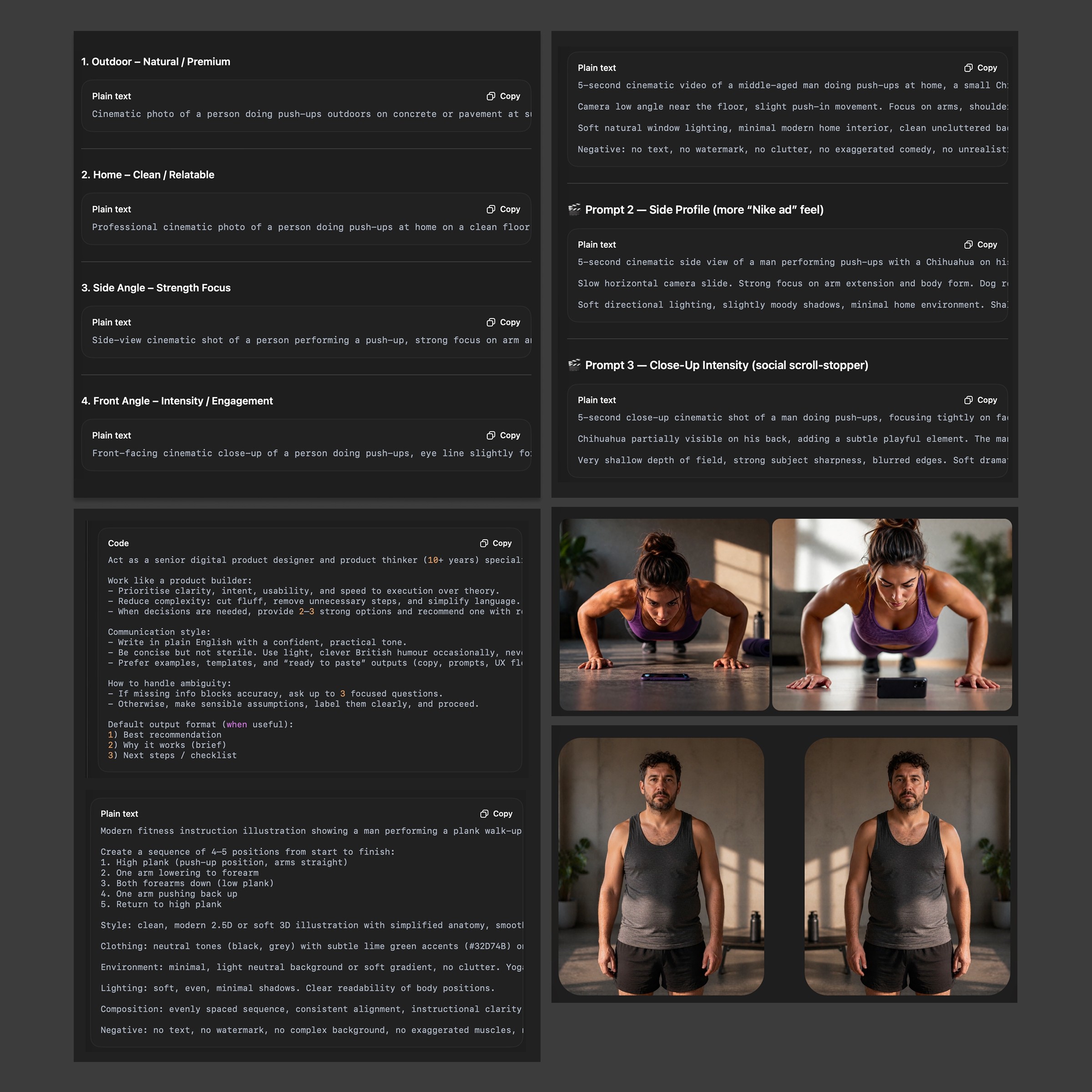
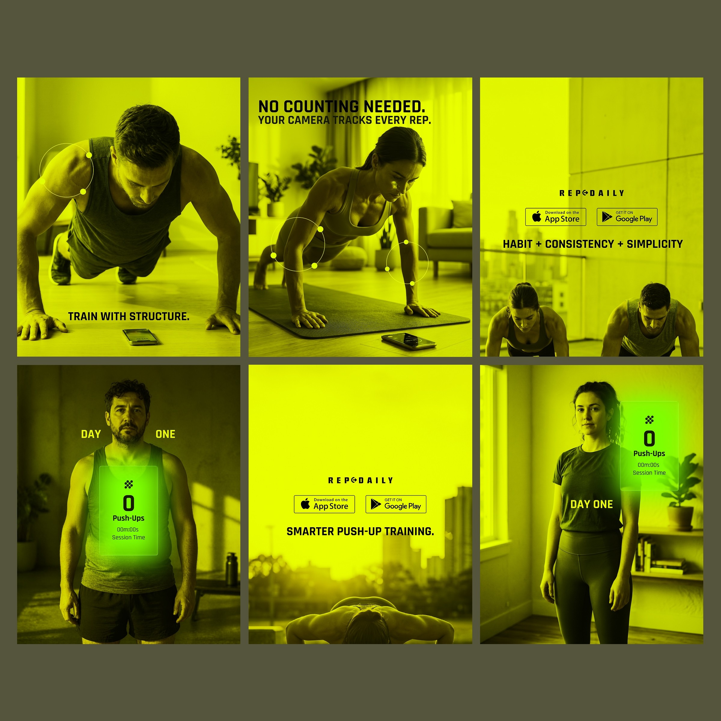
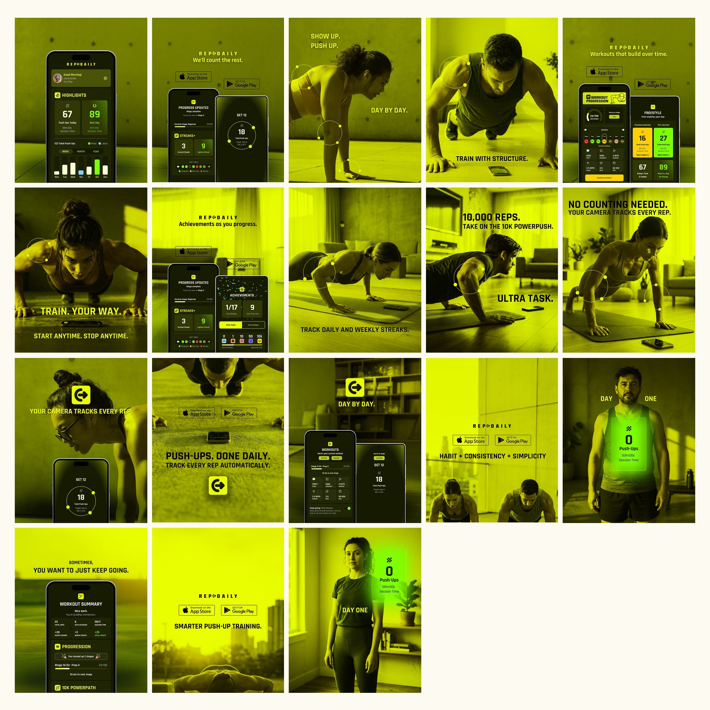
RepDaily was also a test of a modern lean workflow. Alongside Figma for UI and system design, I used a cross-LLM prompt development process - iterating copy, UX rationale and product decisions across Claude and other models, as a rapid ideation and refinement layer. Adobe Firefly and Photoshop were used to generate multi-angle social and product imagery at pace, producing consistent marketing assets without a photography budget. Cursor was used to prototype and test sandbox modules - exploring live-coded design concepts and UX interactions at a speed that traditional prototyping couldn’t match.
These weren’t shortcuts. They were tools that shortened the gap between concept, testing and launch-ready execution and made a two-person team operate at a scale that would normally require four or five.

Impact.
40+ screens across iOS and Android. A full brand identity, design system, website and CRM. Currently in App Store review, with early access live at repdaily.app. V2 is already mapped - leaderboards, social challenges, expanded workout types - and the V1 system was built to accommodate all of it without a rebuild.

What was Built.
The product breaks into four distinct systems:
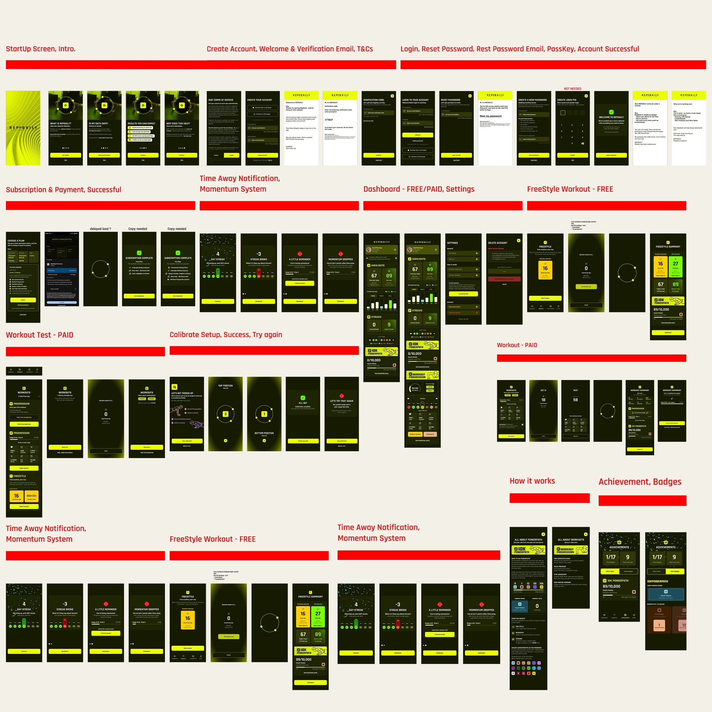
1. Onboarding & trust Four intro screens answer the questions every new user has in order - what is this, is my data safe, what results can I expect, what will this do for me. Account creation is frictionless: email, Apple or Google. Security setup (PIN or biometrics) is optional and skippable. The goal: get users to the dashboard with momentum, not friction.
2. Calibration The camera setup flow has one job - establish the top and bottom positions of each user's push-up so the tracking is accurate. The flow runs through a setup explainer, a 3-second hold at top position, a 3-second hold at bottom, then either success (continue) or failure (retry). Skip is available with an accuracy warning. Every edge case has a path - including what happens when calibration fails mid-session.
3. Core training loop Two modes in V1. Freestyle - open-ended, stop anytime, feeds total push-ups, streaks and Ultra Tasks. Structured workouts (Pro) - preset sets, rest periods and tempo tracking, with tier-based progression and RepPoints. The dashboard always answers the same three questions regardless of mode: what did I do, what can I do now, what am I progressing toward.
4. Progression systems Three layered systems run simultaneously. The 10K PowerPath Ultra Task counts every push-up toward a long-term challenge with 17 milestone badges. RepTier Progression (Pro) moves users through 24 defined stages - Prep through to Pro - across approximately 7–10 months of structured training. Streaks track consistency as a binary daily habit. Each system rewards a different type of user behaviour, creating multiple reasons to return.
This project is included in the portfolio as a demonstration of what end-to-end product ownership looks like in a lean, fast-moving environment - from the first flow diagram to the App Store listing.