
ReadyGo is a pre-activity planning app for runners and cyclists - built around a specific moment most fitness apps completely ignore.
Not the run itself. Not the data after. The ten or fifteen minutes before, when the window opens and the questions start: shall I go out? Where? What's the weather doing? Have I got time? That moment of friction. The gap between thinking about going and actually going - is where ReadyGo lives.
The app builds a personalised activity profile around preferences: run or cycle, weather tolerance, route type, locations. From there, GOAI - the thinking engine behind the product - generates a ready-to-go session in seconds. Route, conditions, effort level. You open the app, make a couple of quick decisions, and go. It's not a coach. It's not a tracker. It's the thing that removes the last reason not to head out the door.


ReadyGo is the second product out of ToDo Engineering, and it became a real test of how far a lean, AI-assisted workflow could stretch.
The design and build ran on a tightly integrated stack - Figma for system design, Cursor and Claude Code for prototyping and frontend scaffolding, Linear for task management, and Gemini alongside Claude for rapid ideation and copy refinement. Rather than moving sequentially from design to handover, the workflow ran in parallel - lofi UI components drawn from the design system fed directly into coded sandbox environments for testing, compressing what would typically take a week of back-and-forth into a single day. Full screen design completed in two days. Feature prototypes for user testing in one and a half. The design system was built to work with LLM token pipelines from the start; size, spacing, colour, movement and layout all structured for clean codebase handover.
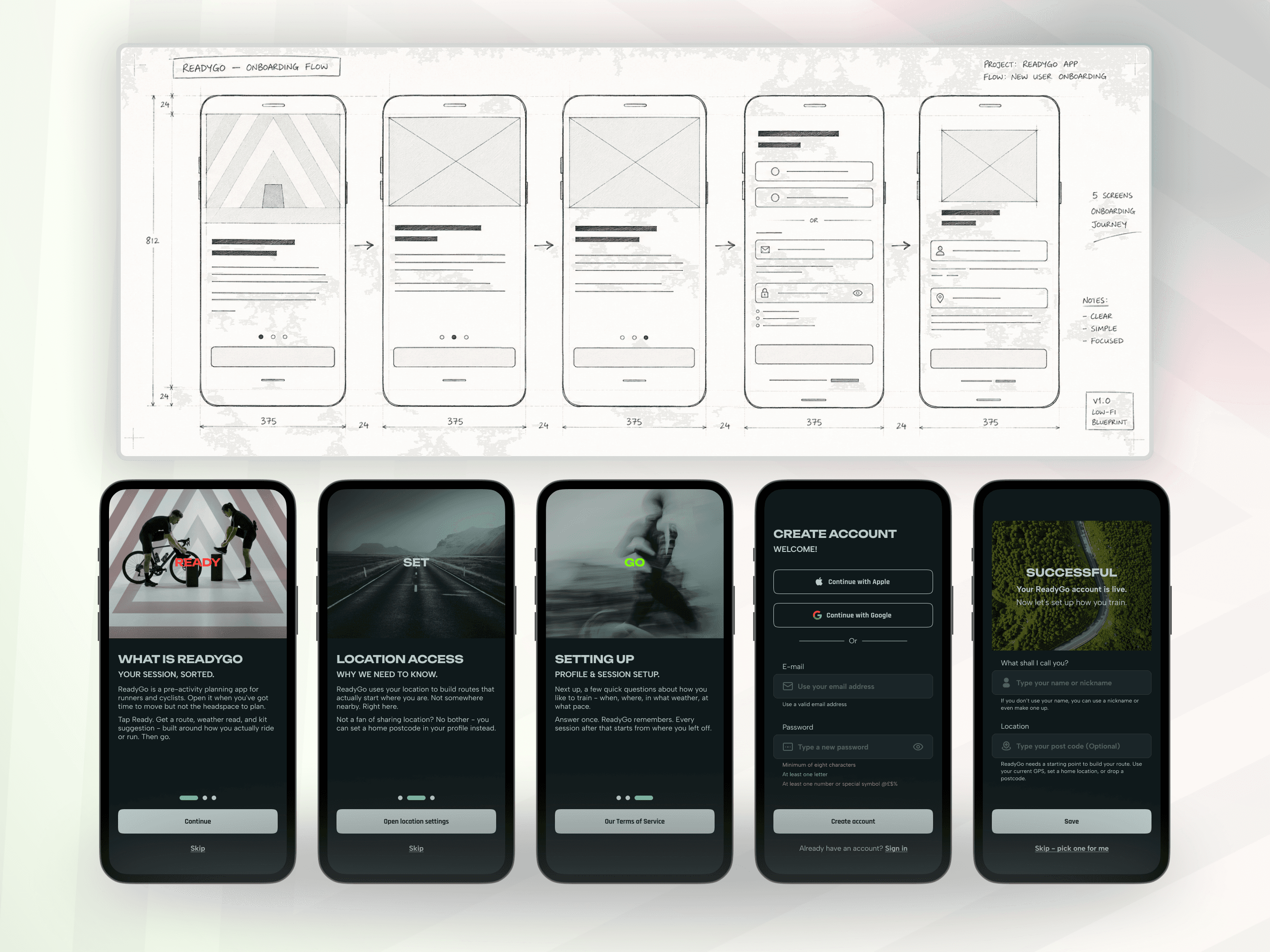
The core UX challenge was restraint. ReadyGo could easily become a feature-heavy platform; weather, routing, nutrition, gear, tracking, social. The discipline was keeping the MVP anchored to one job: generate a session plan fast enough that it becomes a habit, not a task. Every screen, every decision point, every interaction was tested against that single principle.
Visual production used Adobe Firefly to build a consistent image and video library - twenty images and five short videos depicting the preparation moment: people getting ready, not people already moving. That distinction mattered. The brand had to live in the same moment the product does.


Outcome.
ReadyGo is currently in public beta on Google Play at V0.1, with iOS in review. Eight early users are three weeks into a structured four-week usability programme - covering onboarding, session generation, route usability and repeat behaviour across both Android and iOS. Feedback is collected directly inside the app, contextual to screen and session stage, alongside video interviews and prototype testing sessions.
The social and content campaign is live; a six-week rollout across Instagram, X, Reddit, blog and email - with a target of 1,500 users before full public release. The build-in-public phase begins once that milestone is reached.
This project sits in the portfolio not just as a product case study, but as a demonstration of how a modern design and AI workflow stack performs under real conditions - from the first idea through to a shippable, testable product with a live user base.
